Expanding and improving equipment monitoring software
OVERVIEW
Otis Elevator, the world’s largest elevator supplier, had a legacy product that building managers can purchase to monitor their equipment. This software allows building managers to view statuses and take actions on their elevator and escalator equipment.
Originally created over 20 years ago, a replacement product was required to meet modern cybersecurity needs.
Otis outsourced the initial interface work; and, a few months later, requested that I be assigned to the project to “fill the gaps in the mockups.” I worked with the team for about a year to design missed features, test the implementation, and prepare documentation for launch.

Timeline

SUMMARY
Initially tasked with creating additional mockup screens to add clarity for the development team, I identified missing features, usability and accessibility issues, and implementation errors.
Planning design sprints with the Project Manager and Engineering subject matter expert (SME) to accommodate design delivery for existing features for development gave us the ability to plan deep dive conversations with the SME for feature definition and refinement. As the project continued and additional challenges arose, my role expanded to include usability testing and an accessibility audit.
When I was moved onto a new project towards the end of Q2 2020, the first installations of the software were progressing and I was able to hand over improved design files, completed designs, and discovery work for additional features to the incoming UI designer.
ROLE
Sole researcher, UX & UI designer
TEAM
1 Researcher/UX & UI Designer (me)
Project Manager
2 UI Developers (remote)
6 Backend Developers (remote)
2 Marketing Managers
1 Engineering Subject Matter Expert (SME)
METHODS & TOOLS
Research: Expert Interviews, User Interviews, Usability Testing, Requirements Definition
Sketching, Low-fi Mockups, High-fi Mockups, Interaction/Transition Animations
Tools: Adobe Illustrator, Sketch, Figma, PowerPoint, Excel, Webex, Teams
Process
During project onboarding, I evaluated the vendor documentation and design files, Panorama 1.0, and Panorama 2.0 development environment.

The vendor files were Adobe Illustrator screens (converted from Photoshop) and a PDF style sheet.
I created reusable components in Illustrator to quickly deliver some screens, and began transitioning the design files to Sketch (the internal design software at the time).

An example of the initial redline clarifications and feature additions (double-deck elevators) requested by the development team.
I spent the majority of the first three sprints in the “deliver” triangle of the double-diamond, working from the vendor’s foundation and unblocking features for the development team.
As I understood more about the product, I identified usability issues, missing features, and implementation errors.
I held multiple deep dive conversations with the Engineering SME to define and conceptualize the missing features.

The PM and I assigned each identified feature to one or two sprints, depending on the expected feature size.
The first half of the sprint was spent on discovery and requirements definition with the Engineering SME - we reviewed the existed software and I sketched concepts to confirm my understanding.

Example workflow wireframe with notes used in discussions with the SME
In the second half of the sprint, I created mid- and high-fidelity mockups and a clickable prototype in InVision for the SME to test.
While observing the SME using the original product and testing the prototype I noted workflow gaps and workarounds that he was using, and I mapped those for consideration in the product.
Working with the Project Manager and the development lead, my findings were prioritized with the existing work and were entered into the backlog.
When marketing requested press release images, we learned that the product was being advertised as “tablet-ready.”
I recruited two internal testers, in addition to myself and the SME, to assist with testing the development environment on Otis-supplied tablets.
The participants needed to have access to an Otis tablet, some familiarity with the existing Panorama product, and the ability to test onsite for observation.

Testing on the tablets showed that while the software was “tablet-ready,” it was far from user-friendly.
WHAT WORKED
Sign-on and the default view were immediately available
The browser automatically converted some mouse gestures to tap gestures
IMPROVEMENTS
menus were very difficult to trigger via tap
tap targets were too small for all testers except me (I had the smallest hands)
changing views was very difficult to navigate on a tablet
the sign-on screen was only in portrait orientation, but the rest of the software was only in landscape
These test reinforced my suspicion that the interface was not intuitive, and I advocated for end-user usability testing as soon as possible.
I conducted six remote usability tests, revealing a 100% task initiation failure rate.

I created a usability test plan dashboard to communicate the reasoning and needs to the Project Manager and the Business since they had no experience with usability testing.
Of the six building managers and security personnel who agreed to participate in testing, none were able to locate and open the actions menu.

Once they were told how to access the menu, they were all able to complete the remainder of the first task, and could more quickly initiate and complete the remaining tasks.
Also, four of the testers expressed difficulty distinguishing between the grays used in the interface and all testers requested a dark mode.
While the primary call-to-action was not readily available to users, the Business opted to address this with customer training. The accessibility issues were also noted as already in the backlog from my initial analysis of the UI.
Roughly three months later our largest customer requested proof of web accessibility compliance, sparking a renewed interest in my earlier observations.
This customer noted that they would cancel their service contract if this software was not at least WCAG AA compliant.
Following this development, I created an accessibility audit Excel document, using the WCAG standards and the Section 508 checklist as the foundation.
I meticulously reviewed, scored, and annotated the audit during the following week.
At the end of the sprint, I reviewed the audit with the Business, Project Manager, Development Lead, and UI Developers to ensure understanding and answer questions.
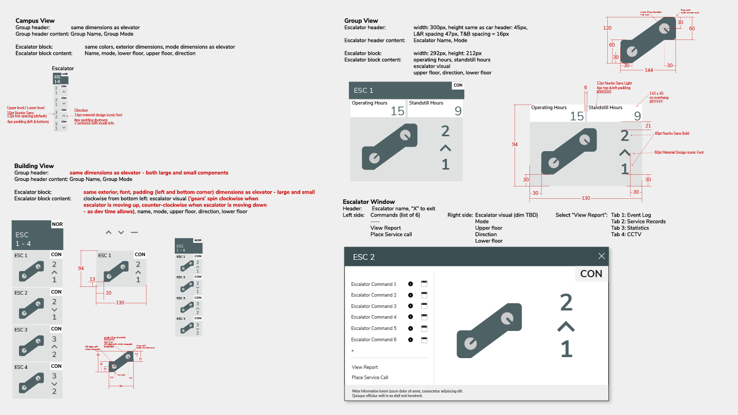
Escalator visualization created within existing visual design parameters

Additional call types and car state visualizations, and a reference key
I was moved to a new team during the product launch and transitioned the files, assets, and documentation to the incoming UX/UI designer. I was also able to leverage learnings from Panorama 2.0 to inform the OID administration console design.